
Introduction
This rant will be about the original releases of the Star Trek TOS movies, none of the re-releases that came afterwards, just the original DVDs. Ok? (And from what I can tell the PAL and NTSC versions are exactly the same, except for resolution and framerate standard and some minor box art stuff, but all the major points I’ll be discussing here will be relevant for both US and PAL releases, even though I only have the PAL releases.)
Like many great discoveries, be it science or elsewhere, it often begins with a simple thought: “oh that’s odd”. That oh so innocent but extremely dangerous thought came one day when I realized that the fifth and sixth installments of the Star Trek TOS movie sixology(?) were mastered differently than the previous movies. There is a significant dip in video quality between these two movies and the rest. For the longest time I just accepted that some DVDs were mastered worse than others or that VLC was not decoding these two movies properly. This problem continued to bother me and my autistic mind forced me into a whole deep dive into the first DVD releases and their weird inconsistencies. Some of my rants will be reasonable, others will be overly pedantic, so be warned. >:]
The Video Quality Differences Between V, VI, and the Rest of the Movies


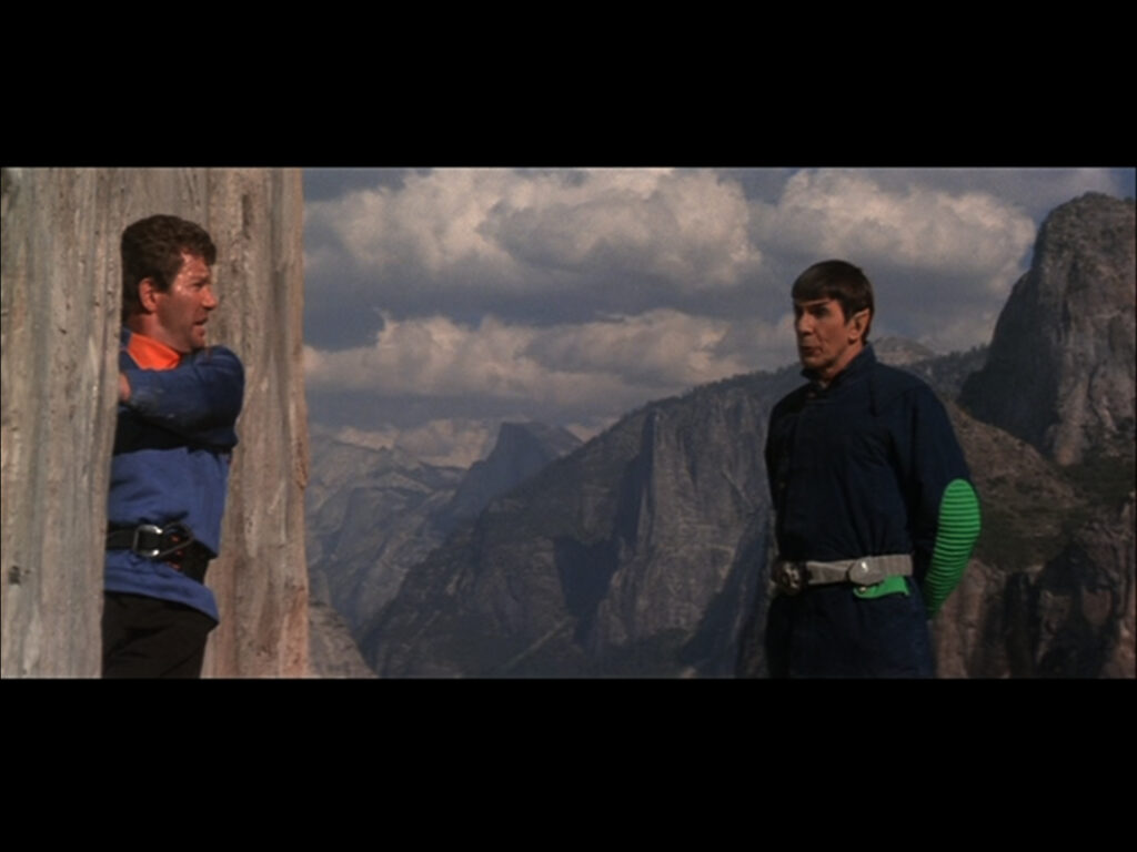
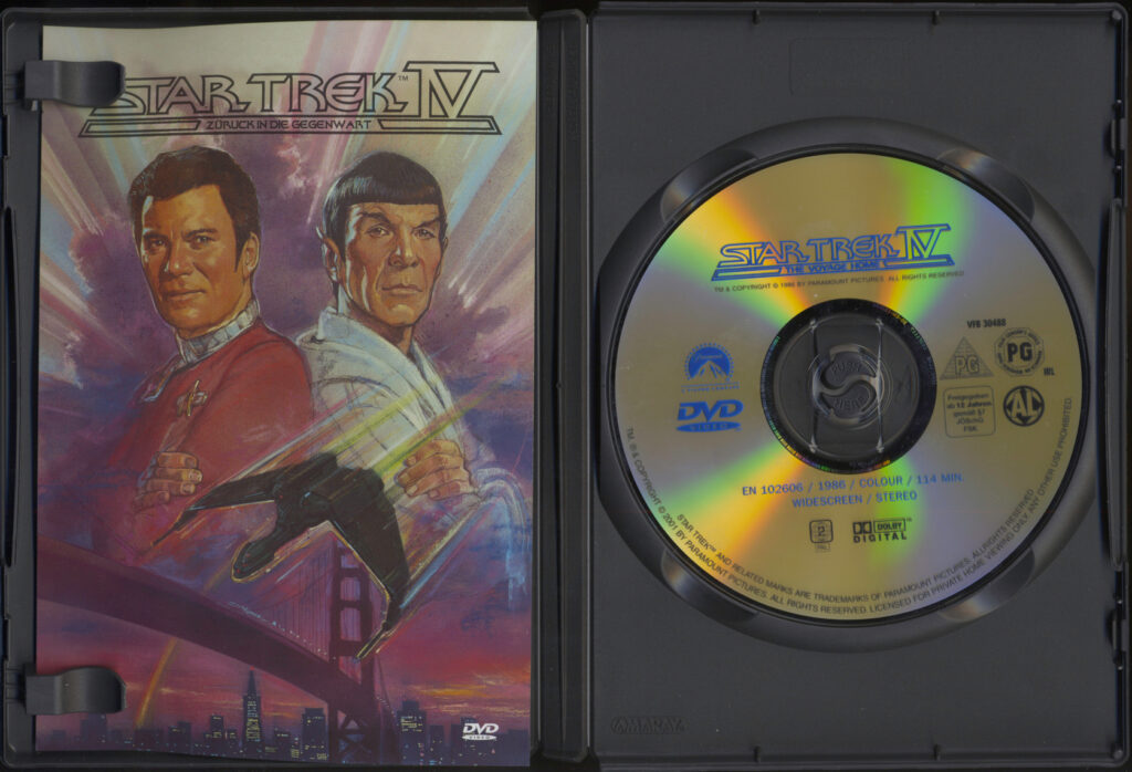
STV (left) and IV (right). Viewed at full screen in VLC while using the default settings (non cropped)
When you play these two particular movies on VLC you quickly realize that with default settings you get a very small image with black bars at the top and the bottom. Now why is this bad? Isn’t that the most logical way of transferring widescreen movies to DVDs, just putting black bars to fit the DVD’s native 4:3 resolution standard?
NOOOOOOOOOOOOOOOOOO!!!!!!!!!!! NEVER!!!!!!!!!!!!!!!!
Most DVD players support something called anamorphic widescreen. Now what the hell is this? Read this relevant quote I stole and modified from Wikipedia and you might understand what it is all about: “It is a process by which a widescreen image is vertically extended to fit into a storage medium with a narrower aspect ratio, increasing its horizontal resolution while keeping the vertical.”
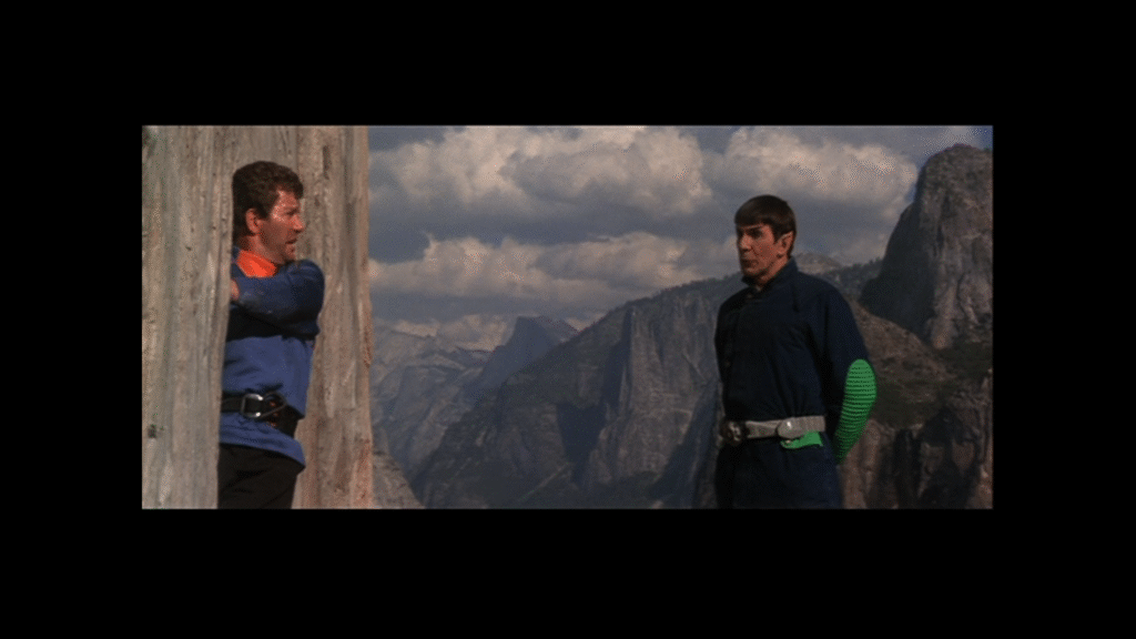
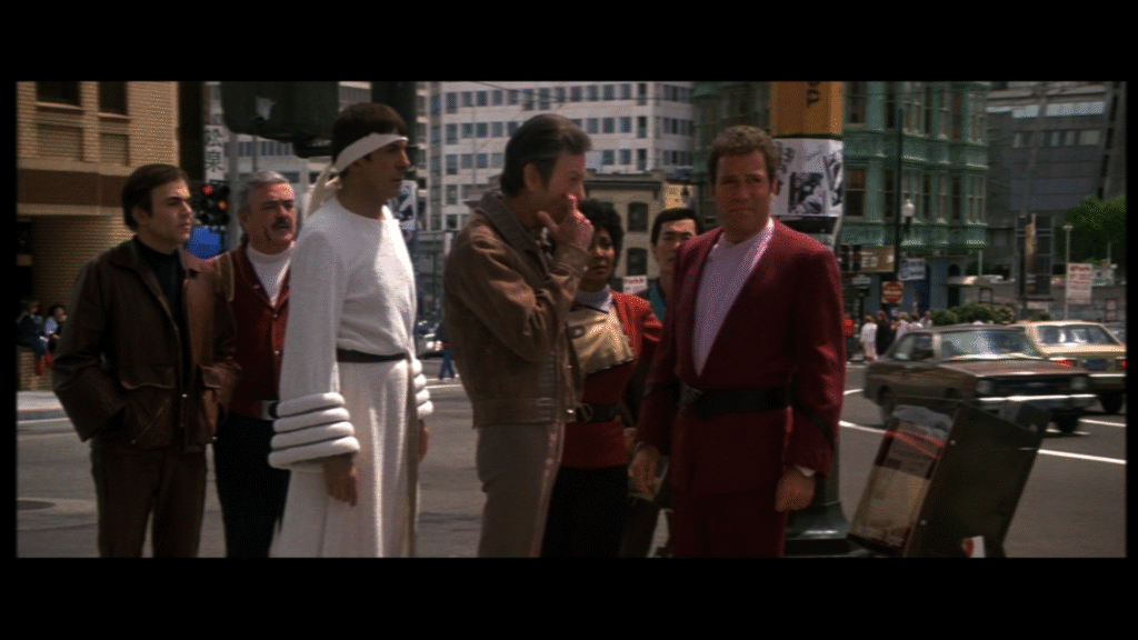
See how when we extend these original 4:3 frames to 16:9, STIV stretches its anamorphic image to 16:9, while STV keeps its aspect ratio.
Important: An anamorphic image uses the full vertical and horizontal resolution of a medium that has a smaller aspect ratio. When an anamorphic DVD is viewed normally at a 4:3 aspect ratio the image will look horizontally compressed and when stretched to something like 16×9 it looks normal again.
STV and VI are not anamorphic movies, meaning they do not use the full vertical resolution of the DVD video format and are therefore wasting a lot of image quality, only 75% of the total resolution is used. (Calc: We superimpose a 16:9 image into a 4:3 square. They’d both have the same width but not the same height. The height for a 4:3 frame would be 3:4*width of frame. For a 19:6 image the it’s 9:16*width of frame. The area of both frames is just height*width (for 4:3 the area would be 3:4*width*width) We then divide the area for 19:6 by the area for 4:3 and get a percentage difference)
I hardly believe that this was in any way cheaper than doing it anamorphically. According to Memory Alpha the movie was shot on 4perf Super 35, a non anamorphic image format, however this version was never released publicly and what was shown in theaters was a 2.39:1 cropped and anamorphized version of the original, meaning THEY HAD AN ANAMORPHIC COPY OF THE MOVIE, WHY DO THIS GARBAGE!? The only reason how I can explain this weird choice is from the fact that the theatrical movies were released in a reverse chronological order for home release, meaning that when STV and VI released on DVD, they were the first movies in this set to release on DVD, it was still a very new format and the people responsible for the DVD release were probably unfamiliar with all of the new features of the DVD format and treated them like VHS.
Interestingly enough they never claim the movies to be anamorphic to begin with.
See this tiny difference? (The pictures might be a bit too low res to see it (I sadly don’t have much storage space in WordPress to afford high res images (which I do have!)), but I didn’t want to crop them or else there is possibility for confusion and misinformation. You should however see an extra line of text.)
I only now noticed that there is a special label for anamorphic movies on DVD boxes, which is nice and convenient for nerds like me who care about this stuff, but this labeling is not standard across different DVD sets, boxes or releases, so why even bother with life when it always disappoints…

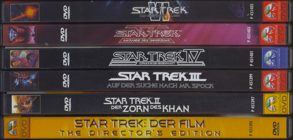
The Inconsistencies In The DVD and Box Artwork
Star Trek TMP vs The Rest
Let’s start off with the most visually striking inconsistencies in this set, the Star Trek The Motion Picture Directors Cut box art vs the rest of the movie releases.
All movies use their original classic easily recognizable font we’ve come to love from the movies for the end label. Then there is Star Trek TMP which uses a completely different font for the end label while using the original font for the main box art! The main box art doesn’t even have the original rainbow title art, it was replaced with some golden 3D Voyager’esque title art! I guess it’s meant to celebrate the release of the all new directors cut or something, with it being gold and all, but it just looks out of place and dated.
Then there is the WIDESCREEN DVD COLLECTION label (which thankfully looks very plain and doesn’t distract from the main art like oh so many widescreen releases fail to do) which annoyingly is at the top instead of bottom of the side label and main box art, instead of at the bottom where it rightfully belongs to on all of the other releases!
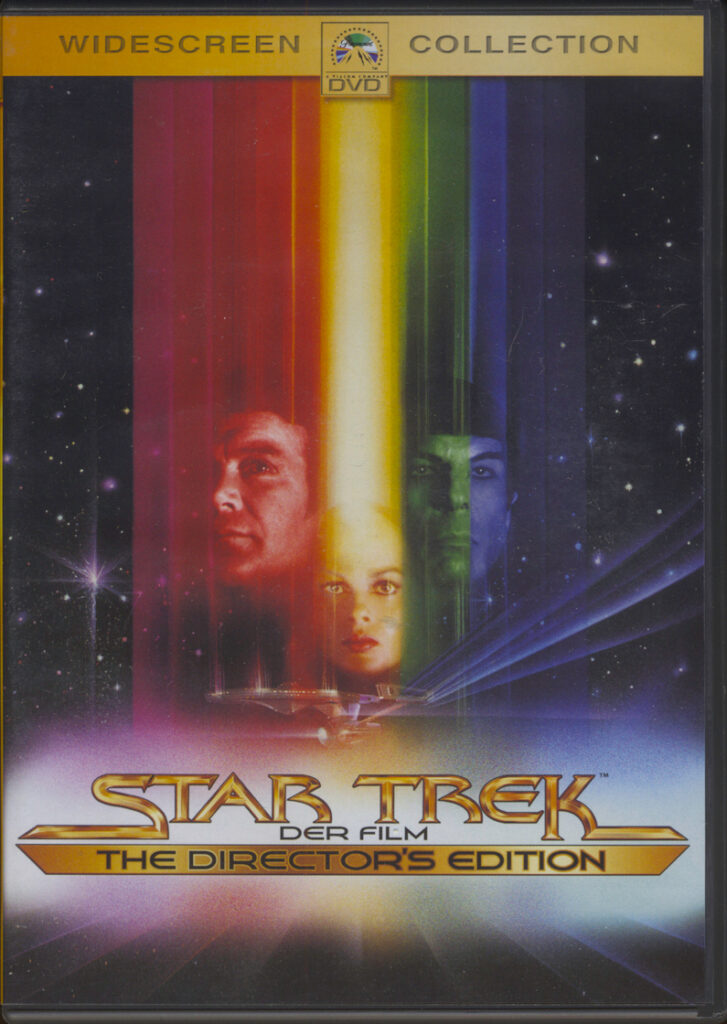
See the differences in logo stylization and the widescreen label placement?
The Inconsistent Backsides of the Movies
Most of the movies use Times New Roman for their main text segments on the back side of their respective boxes, which is an interesting choice if I can even call it a choice since it’s so ubiquitous and overused that choosing to use it intentionally is no choice at all. (I will forever hate Times New Roman and people who think it’s a great font choice, because it isn’t.)
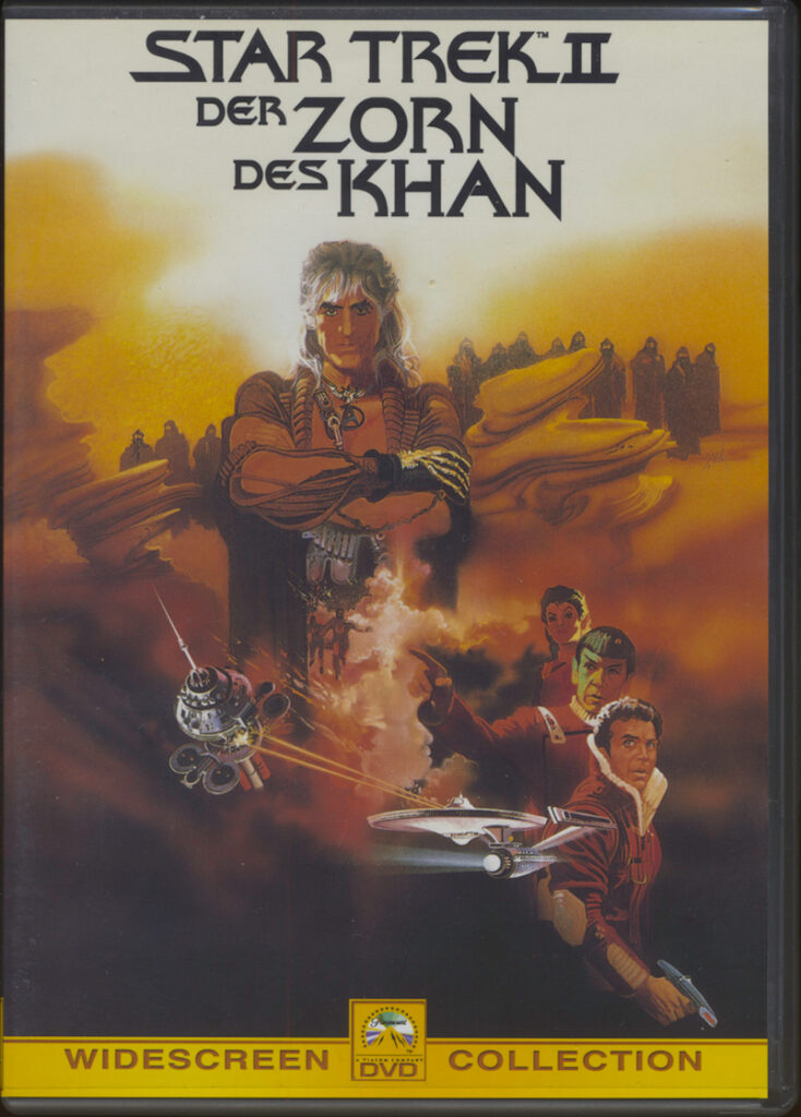
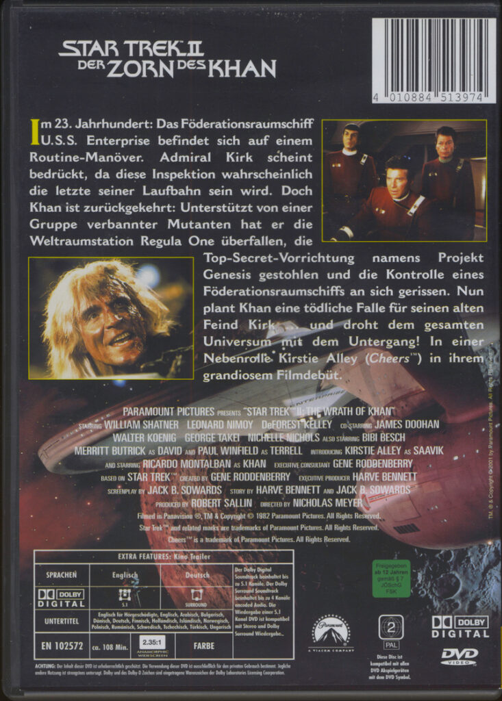
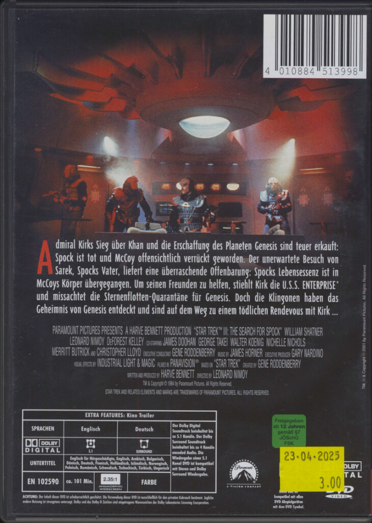
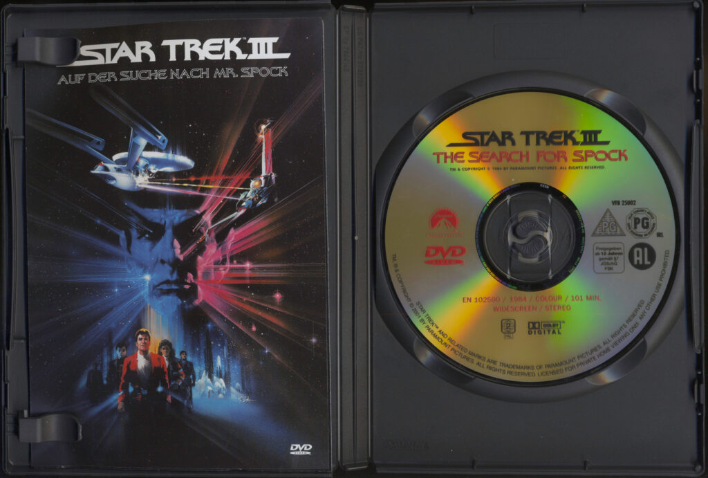
ST II and III have gone a different, more original route where II uses the same font as the title, which I find neat, while III uses some rounder variant of the title font sans serif, or at least it looks like that. I’m not a font expert and I couldn’t find a good match except for the title font.
The Inconsistent DVD Labels
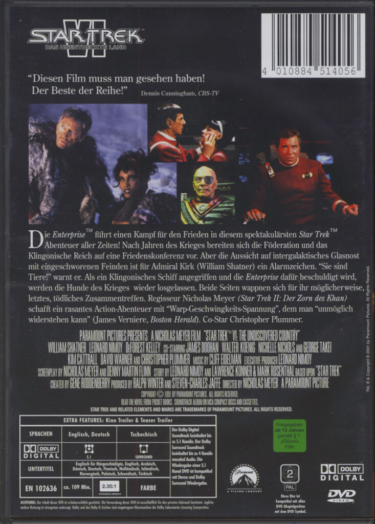
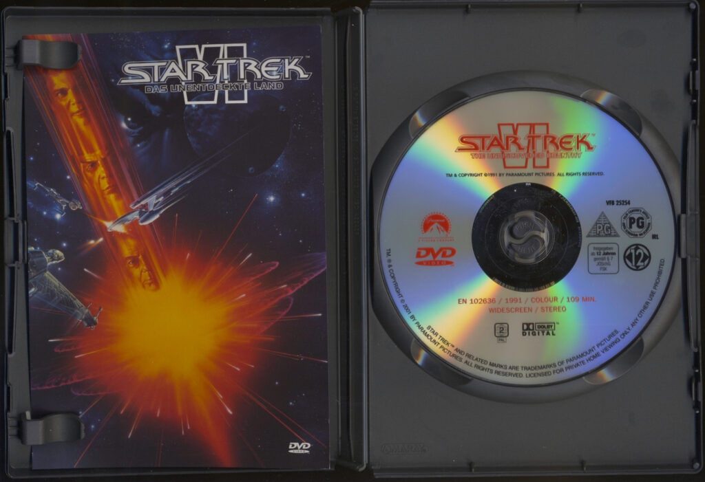
It makes sense that ST TMP gets a special DVD disk design (being so different to the other releases) having some nice abstract yellow hexagons, a reference or callback to that one scene inside V’ger. Though, what confuses me is why Star Trek II Wrath of Khan got the same treatment while all the other movies use the very plain DVD art from the 90s.
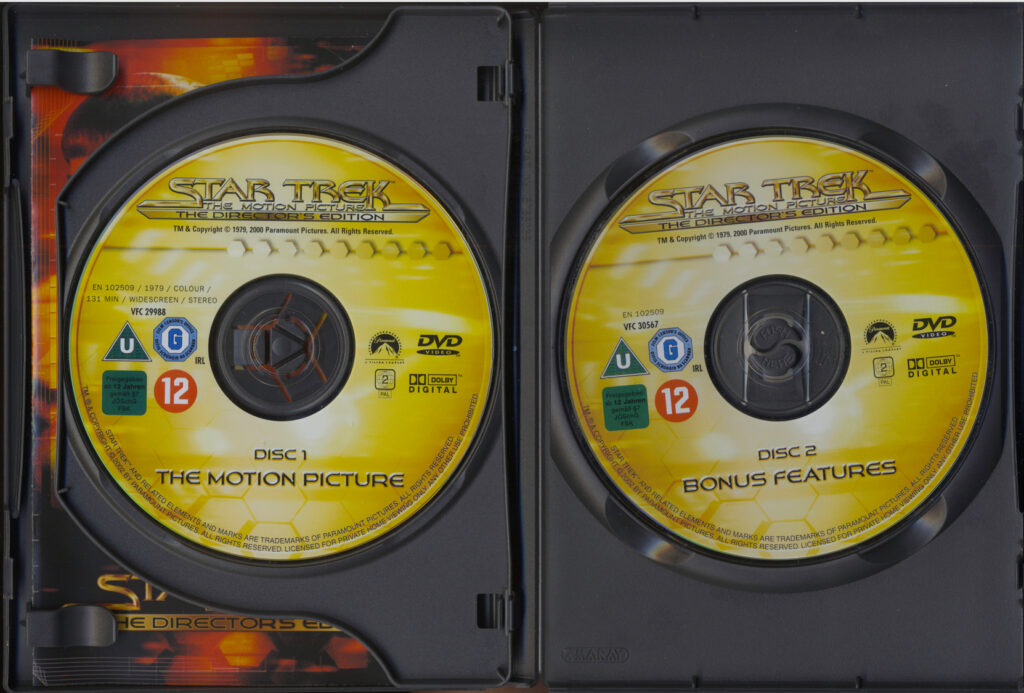
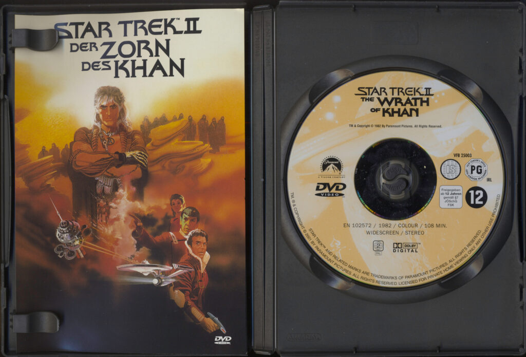
I at first thought that my DVD set might not have initially been the original complete set, where the owner might have bought all of the releases separately and bought a much newer version of ST II, but no! I searched the entirety of eBay (and some of the internet) and couldn’t find a single copy with a silver-ish DVD design that you get with the other movies, which would mean that it just released like that. With a different DVD design. For no particularly good reason.
…
[Flips table, screams in agony]
Ok, maybe it’s because the movies were released in reverse order and mayyyyybe they always wanted to have these more colorful DVD designs and were limited by the technology at the time, but I am still a wee bit angry.
A minor annoyance for PAL collectors is that the DVDs have the original english titles instead of in whatever language is on the box (mine being german), which I can only attribute to lazyness. Since they’re already releasing different versions for different countries (the german version does not have french or italian dubs for instance, so there are at least three countries that get each a separate release in Europe alone) and are redesigning the logos why not go the extra step and redesign the logos on the DVDs?
There is a minor difference between the DVD design of STV and the rest of the silver 90s DVD releases. It has the DVD logo on the right side now and the age rating is completely gone. I’ve searched eBay again and couldn’t find a version with the age ratings on it, meaning it’s either some kind of error that never got caught or the DVD release is so old that it released at a time before it got mandatory to print them on the DVDs themselves, but then again, why does STVI (which released earlier) have the age ratings?
Why Does Only Star Trek The Motion Picture Have a Remaster And Lots of Bonus Content?
Market and popularity wise it was a very strange and risky decision to redo the whole movie, it must’ve certainly been an expensive endeavor. It could have flopped hard (which it already did in theaters due to its rushed release and unfinished state, so this wouldn’t matter, but still) like the TNG Bluray re-releases and shied away Paramount from doing remasters ever again, but it didn’t, it was a success. We have to thank Robert Wise for insisting or remastering the movie and being so disappointed with the original theatrical release. This remastering spirit probably gave the DVD release a lot of extra content added to it too. Some of the other DVD releases have some bonus content, though not as much as TMP, about which I might write an edit at the bottom of this post later if I find something annoying or peculiar about their bonus content.
The Directors Cut never got a Bluray release, probably because it was rendered in SD and re-rendering ancient Lightwave (I’m saying Lightwave because Lightwave was historically THE Star Trek movie rendering engine/software) scenes would look bad, be it low resolution textures, low poly models or something else and it would be pretty difficult/expensive to find the original scene files in some archive inside a salt mine under Hollywood. (If they (still) exist in the first place)
So, keep a copy of the DVD release, it’s well worth it even in an HD or 4K era of movie releases!
Sources:
https://treknostalgia.blogspot.com/2009/03/star-trek-home-video-saga_06.html
https://memory-alpha.fandom.com/wiki/Star_Trek_VI:_The_Undiscovered_Country
https://warpfactortrek.com/future-proofing-star-trek-the-motion-picture-the-directors-edition-david-c-fein-interview/
https://en.wikipedia.org/wiki/Anamorphic_format
https://www.ebay.com/